What is a call-to-action?
A call-to-action (CTA) is a piece of content on a webpage or advert that prompts your audience to take the next step, whether it is to make a purchase or learn more about your products.
Your CTA can be an image, hyperlink or button. But buttons are by far the most commonly used format for a call-to-action, so keep that in mind.
Types of CTAs
You’ll have a host of CTAs across your website, which type you use will depend on the intended action for leads. Here are a few of the main purposes of CTAs:
- Lead generation
- Grow your email list
- Collect form submissions
- Encourage readers to learn more
- Take leads to your store
- Share your feature list
- Direct to your social media accounts
- Sign up new users
- Promote events
How can a good CTA improve conversion?
A good CTA will stand out to your audience and creates a sense of urgency. You have to remember that website visitors (or ad viewers) will see the same old words and phrases over and over.
So, you have to find a way to be both original and persuasive in a concise way.
There also has to be clear intent in your CTA. This is to say that anyone who reads it will know exactly what action they’re about to make when they click.
It’s not just the CTA text that has to draw your audience in. There are multiple factors that contribute to an effective call-to-action.
- Eye-catching design
- Compelling copy
- Placement and visibility
- Solve a problem for your audience
Eye-catching design
First of all, you should already have a solid design for your page/ blog post/ advert.
This design should be consistent with your branding and will be one of the first indicators to readers that your content is worth sticking around for.
Your CTA should then stand out from all your other content. Usually, this is done by choosing a button color that contrasts with the rest of the page.
It’s also important to consider how your content and design encourage a natural flow towards your CTA, both in messaging and structure.
Compelling copy
Whilst your CTA button design is a factor you have to consider, its copy is much more important when it comes to converting visitors into leads or customers.
Now the big challenge here is the limited amount of space you’ll have to write compelling content, especially if you’re using a button.
The CTA text itself should convey the action your audience is being asked to take. E.g. “Discover our products” or “Visit our store”.
If you’re worried about overfilling your button with text, you can always write some copy in the surrounding area to accompany it.
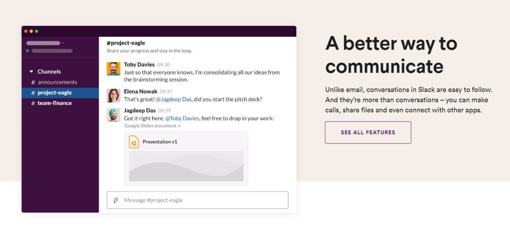
Slack is a great example of this, giving a summary of what prospects will be taken too without overloading them with information.
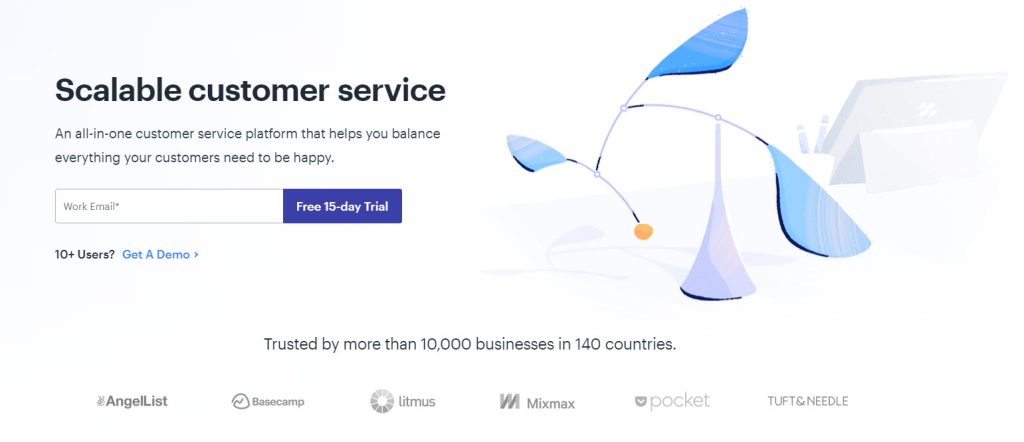
And you can do it without writing a whole paragraph, HelpScout targets readers who have a larger user base and offers them a custom CTA: “10 users? Get A Demo”.
Placement and visibility
Where you choose to place your CTA is essential to its success. Firstly, it has to be visible to your audience. You can’t expect readers to go searching for your CTA, it absolutely needs to get their attention on its own.
And secondly, the content itself has to have an impact on them. You can achieve this by offering a solution or writing copy that evokes emotion in readers.
Below are some stats collected by Grow and Convert on the what CTA placements have the highest conversion rates.
- Sidebar CTAs: 0.5% – 1.5%
- Generic end of post CTAs: 0.5% – 1.5%
- Pop-ups: 1% – 8%
- Sliders and bars: 1% – 5%
- Welcome Gates: 10% – 25%
- Feature box: 3% – 9%
- Navbar: Varies
As you can see, where and how you display your CTA has a massive impact on your conversion rates. And it’s clear that Pop-ups, Welcome Gates and Feature boxes are likely to have the highest return.
Pop-ups and Welcome Gates are more aggressive than the other options, so overusing them can frustrate your audience.
But as they have such a high click-through rate you will want to take advantage of them, so it’s just about finding a good balance.
Solve a problem for your audience
Audiences will be reading your content because they have a need or a problem that needs to be solved. Whether it’s to fill a gap in their knowledge or service they need to be provided, they’ve come to you for answers.
Use your CTA to show leads you can provide that knowledge or solve their problem. This is a tactic sure to increase your click-through rate and build a stronger relationship with your audience.
Improving your conversion rates
So you have a CTA you like, but it’s not performing the way you want it to? Don’t worry, you’re not the first to experience this.
Here are a few tips we’ve picked up for improving the “clickability” of your CTAs:
A/B test your CTAs
If you’ve not heard of A/B test (split tests), it’s where you create two or more variants for content and show it to different people in your audience randomly.
Split testing is essential for increasing conversions, as you can identify which call-to-action button performs the best with your audience.
Don’t split test too many variables at once, as the more you have the longer you’ll need to test for a definitive result.
The best thing about split testing is its versatility. You can run an A/B test on any of your campaigns or content to improve your overall digital marketing strategy, whether it’s an email subject line or Facebook ad.
Write copy in the first person
We’ve already made it clear that effective CTAs address a need or solve a problem. You should couple this with copy written in the first person to further personalize each leads individual experience.
By first-person copy, we mean using “my” instead of “you” or “your”. This makes your content all about the reader and each action feel unique to them.
Add a muted CTA
A muted CTA is a second button placed next to the first that encourages leads to make a different action.
This might seem counterintuitive, as you don’t want two competing CTAs in the same space, but they’re a good option for when you want to provide leads with more information before they click your main CTA.
It is essential that the muted CTA is a different or ‘muted’ color, as not to draw attention away from your primary CTA.
Each has a target audience at a different stage of your sales funnel, so it’s important to highlight this in the CTA design.
Below you can see that Asana does this expertly, encouraging leads to request a demo before creating a free account.
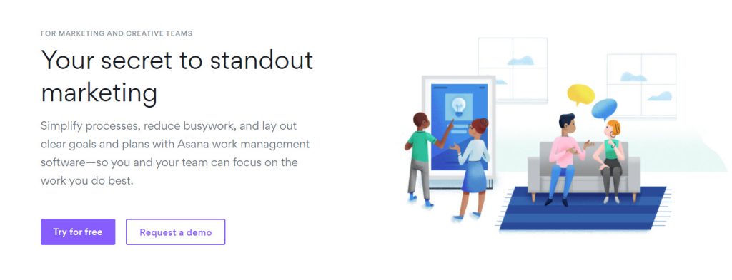
Those who are ready to sign up are ready to make a decision and convert, whilst those who interest or evaluation stage will need more information before committing.
8 Tried and tested CTAs
We wanted to give you an idea of the most used CTAs and how they grab attention. But don’t worry, if you’re not a fan of the standard CTAs in the headings, we provide some robust alternatives in the sections below.
1. Get started
“Get started” is one of the most commonly used CTAs, especially by Saas organizations. And for a good reason. It’s an actionable phrase with clear intent for your audience.
If you’re struggling with a CTA for your homepage or pricing table, we’d recommend you go with this. It isn’t the most exciting option, but it is a safe play.
2. Sign up free
So you’re looking to get more users signed up and you need something to catch their eye. They’re going to be looking for a sign-up button of some sort, so don’t get so creative with the copy that risks leads mistaking it for something else.
Adding “free” to your sign up CTA is an extra incentive for leads to take action. It lets them know they can start testing your product without paying upfront. And that sort of good-faith agreement is a great way to build relationships with your potential customers.
If you’re not a fan of “Sign Up” you could always opt for “Create an Account” instead. It has the same intent as “Sign Up” and primes users to fill out their details.
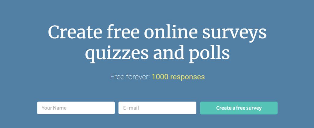
Alternatively, you could describe what exactly will be free once they create an account. FreeOnlineSurveys does exactly this (“Create a free survey”) with their sign up form:
3. Get in touch
This is another example of a strong CTA with a clear directive. You’ll be using this on a contact page, your homepage or possibly in your website footer to encourage a point of contact with prospects.
Some do go for “Contact Us”, but we do think “Get in Touch” is a little more personable. And you do want to seem human to your audience.
If you have a targeted inbox for more specific inquiries, you can always customize your copy to indicate this. For example, “Get in Touch with our Sales Team”.
4. Learn more
If you need to explain how your product works for leads to make an informed purchase, you should use the “Learn more” CTA to do this.
Link it to a landing page or blog post with more descriptive content. You don’t need to get too creative with the CTA copy, but it should be placed near an image of the product or in the product page header.
This way it’ll be clear to leads what specifically they’ll be learning more about.
5. Add to cart
It’s best to be direct with product CTAs. If a lead is already on your product landing page, your next task is to get them to add it to their basket/ bag/ cart.
You’ve already piqued their interest with your content and product images, so you now need to encourage them to commit.
And a direct approach is the best way to do this. If you’re not seeing a great conversion rate on this CTA, you may need to consider tweaking your supporting content to focus on the benefits of your product. Or, you could even offer an extra incentive like a discount or deal.
6. Buy now
Just like “Add to Cart”, “Buy Now” is a little more direct, which can be risky when you’re asking customers to commit to you in this way. But it can definitely work to encourage leads to purchase a product.
And the other benefit is that their intent is clear when they click, which is a powerful indicator of your product’s appeal.
7. Subscribe
You’ve probably seen this CTA being used to get you to subscribe to an email newsletter or marketing chain. But it’s not very persuasive in and of itself.
So you’ll want to add some text in the area surrounding the CTA to explain the benefits of your email campaign. What problems are you solving? How does your content stand out from the competition?
Or even better, you can offer a lead magnet to get people to subscribe to your email list.
Once you’ve gotten people subscribed to your list, you’ll need to think about your email strategy, head over to our email marketing guide for a full walkthrough and some helpful tips. But if you want some help creating an engaging campaign from your very first email, take a look at this guide for writing a welcome email.
8. View demo/ Book a demo
Offering a demo often makes for an effective CTA, as leads can get a good overview of your product without any commitment.
But whilst “View Demo” and “Book a Demo” are actionable CTAs, they don’t carry much impact.
Salesforce does a great job of preserving actionable intent, whilst also spicing up the copy of their button with something for conversational.
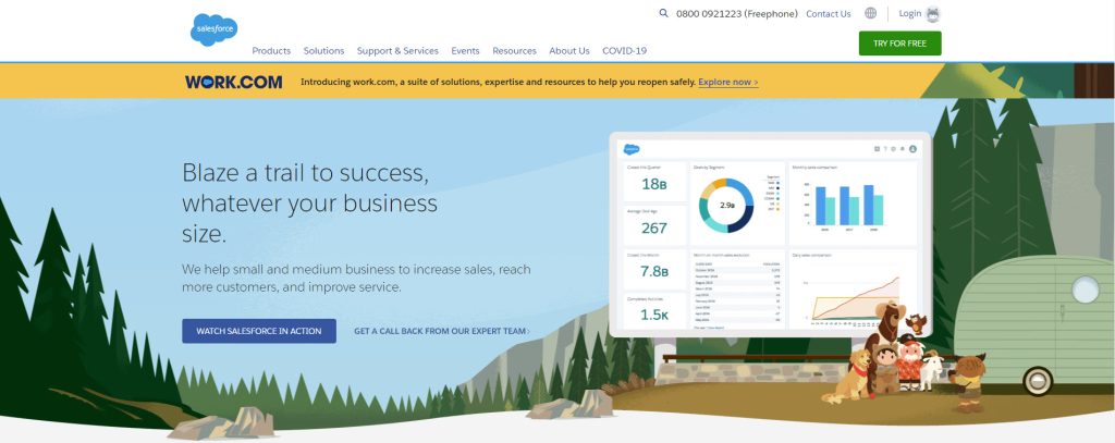
“Watch SaleForce in Action”, there’s just something about that copy that makes you want to click. And there’s no reason you can’t replicate this for your own landing page.
Conclusion
Calls-to-action are some of the most important elements on a page, so writing great copy is essential when considering how to launch a new website.
For more of an idea of the what copy creates the best CTAs, take a look at this list of buzzwords for your call to action.
And we wanted to finish by rounding up all our points for creating a successful CTA:
- Standout design
- Compelling copy
- Actionable intent
- High visibility
- Solves a problem/ address a need
- Split test your call-to-action!
- CTAs shouldn’t compete with each other
- Written in the first person
It’s essential for leads to know what’s in it for them if they click your CTA. Ensure your content makes it clear what the benefits of clicking your CTA are.
And remember it’s not just about your button color or CTA text, the placement is super important.
Finally, you absolutely have to follow through on your promise. If a lead gets to your landing page after clicking your CTA and it isn’t what they expect, they’re certain to bounce.
For more information on increasing conversions, take a look at our article on lead form optimization.


